Featured Projects
We have lots of wonderful clients and fascinating projects but we want to share with you here some of our latest favorites. In each case presented on this page we were given an interesting problem to solve and were able to complete the projects to both the client’s and our own satisfaction (and we are picky!).
New developments in building websites occur often and we have been keeping up on them. Currently WordPress sites have become very popular for medium sized businesses and non-profits. We have scholled ourselves in the new Gutenberg and Full Site Editing features in WordPress and are producing beautiful new sites on the platform.
As always we are dedicated to producing websites that are responsive and accessible serving content that is easy to read and access no matter what devices site visitors are using.
Testimonial
Working with both of you has just been a wonderful experience. You give us the flexibility of integrating our creative consultant with your web design. The development and implementation process was well organized. And we rely on your help with quick page updates which saves us invaluable time.
Beth Lambert, CEO
Herbalist & Alchemist, Inc
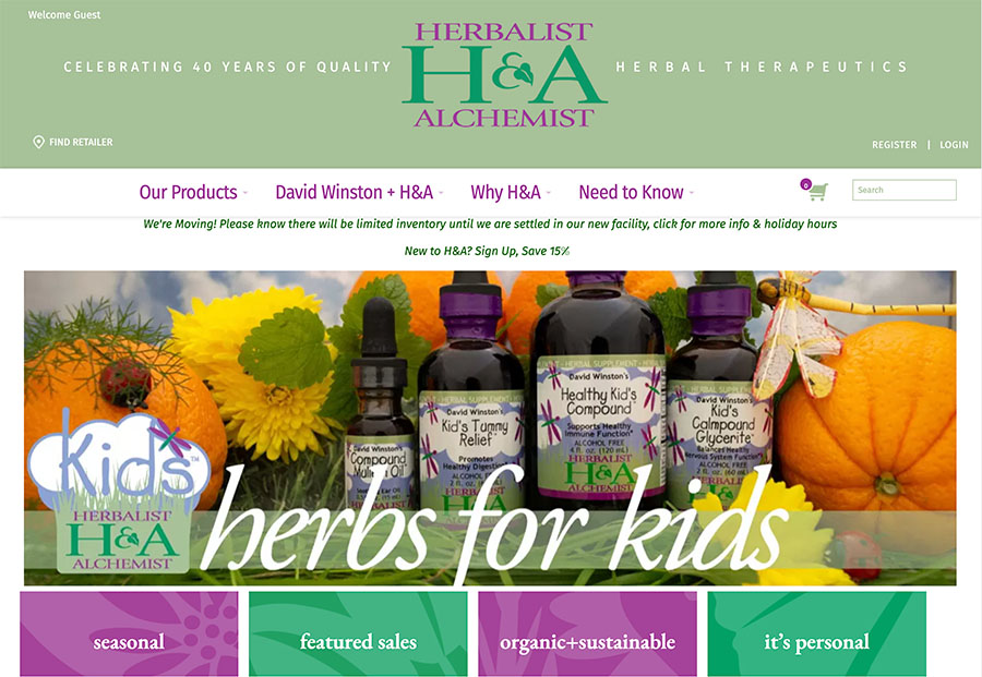
Herbalist & Alchemist
We have been working with Herbalist & Alchemist for almost a decade. Their website has undergone 2 major revisions in that time and we are set to revise it for 2023 with an easier to use interface for their customers.
Sea Turtle Sightings Hotline
For more than a decade, the Sea Turtle Sightings Hotline, operated by Mass Audubon’s Wellfleet Bay Wildlife Sanctuary, has worked to gather data and raise awareness about sea turtles in the region.
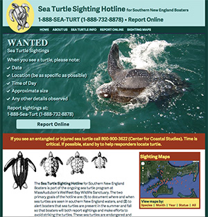
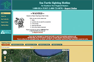
The project’s mission is one that High Road strongly supports. In 2009 we took over serving the Hotline’s original website and improved it by adding descriptions of the sea turtle species, images of free swimming turtles, and geo-mapping plots showing sightings over the years.
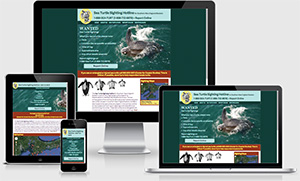
In 2015 we spearheaded a major redesign of the website so boaters could use the site well while on the water. In the site redesign it was important to address some specific issues: that anyone, on any device, can use the website both to report sightings quickly and to help identify what sea turtles they see; that the phone and online reporting were prominent no matter what device a visitor was using; and that turtle photos, which could help with identification, could be easily found and be high enough resolution to help, even on phones. We managed to meet all those criteria and still have quick load times.
By making the site responsive we also helped ensure the site is more likely to be found in an online search.
New Bedford Whaling National Historical Park
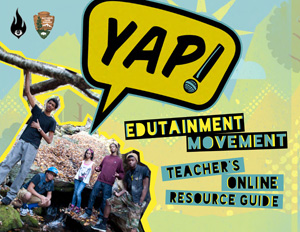
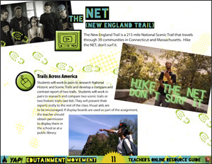
The Park came to us with a request to create a Teacher’s Resource Guide for their Youth Ambassador Program (YAP!) to accompany their recently produced album. The Guide needed to be easily distributed through email and the web and also needed to link directly to resources online, so an interactive PDF was determined as the way to go.
The Guide that we produced picked up the design elements used in the album art and included images from YAP! videos. It incorporates links to audio, video, and web pages. One of the challenges was to keep the PDF to a manageable file size even with the inclusion of so many design elements. The final PDF can be accessed from the Park’s website at www.nps.gov/nebe.
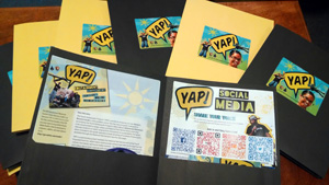
As a continuation of this project, YAP! took part in an Underground Railroad conference. The Park asked us to help them produce materials for that conference that included flyers with QR codes for instructions on screening the YAP! documentary, the Teacher’s Resource Guide, YAP! social media and the YAP! app. We helped the Park determine the best (fastest and cheapest) way to produce and package the materials, all with the design style created in the PDF project.
Peter Briggs Insurance
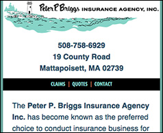
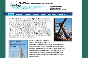
High Road had done the initial design on the Peter Briggs Insurance website in 2010 and they were quite pleased with the result. But in the meantime, the web and the types of devices we use to access it have changed. When we went back to assess their site in 2014 we also realized that a number of links to outside sites (insurance agencies) were no longer current. So much can change in 4 years time!
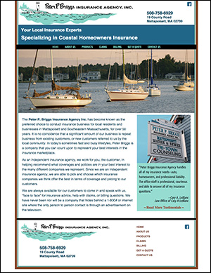
Since we needed to clean up the broken links, we spoke with PBI about convertng their site to a new, responsive, design. It gave them an opportunity to go over their content and freshen it up and we got the chance to give them an updated look.
In all our conversion to responsive design projects, we are particularly aware of some key things: that branding and look and feel are consistent;
that we do our best to make images and graphics both support the branding and load quickly on devices that may not have a fast connection; and that the most
important information for the user is easy to find and quick to access. To that end, we decided against a "hamburger" menu icon on the small screen version of
the site and instead opted for the 3 most important sections of the site right at the top of the page, with the 3 other major site sections at the bottom.
This makes it very clear to the user what kind of content is on the site and it is not hidden.
